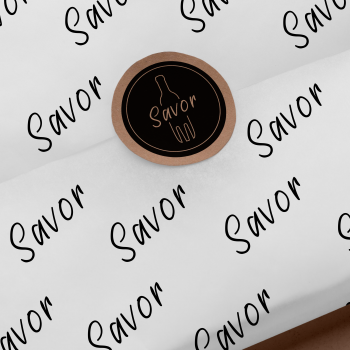
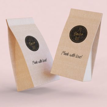
Savor
SAVOR, or in full, Savor your Kitchen is a small local business. They asked me to provide branding for their business. Food and drink is at the heart of their identity.
As they describe themselves on their website:
“All our concepts are aimed at taking you into our passion. By keeping everything we offer as accessible as possible, we hope we can inspire everyone to start seeing food and drink as a complete experience.” A great challenge for me as a designer. Turning a unique concept into a design.
The main task was to make it accessible to everyone but at the same time have a chic twist.
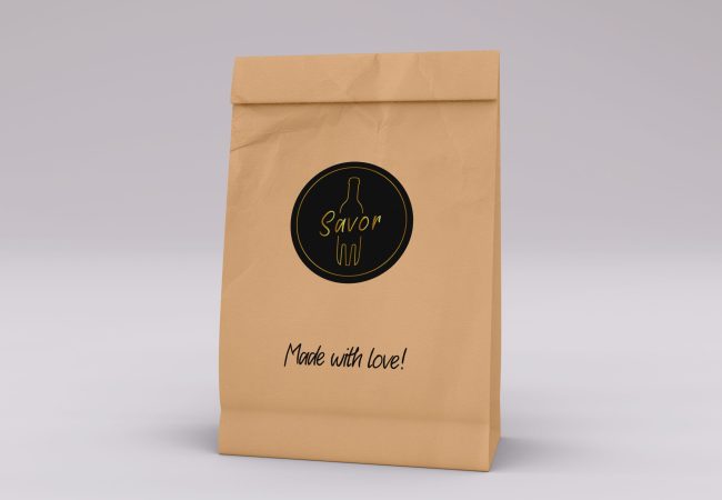
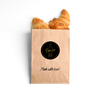
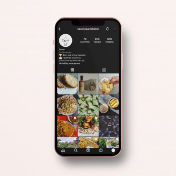
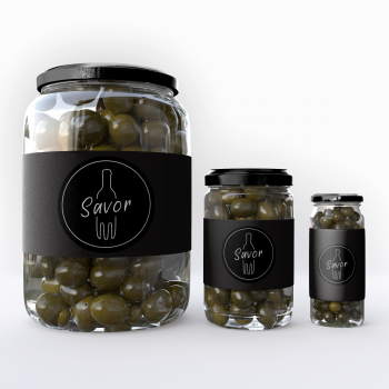
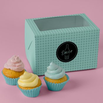
In the process, as mentioned above, food and drink should somehow come back into the trademark. The client wants to express the logo mainly on social so digital for example but also printed on their food packaging. In consultation with the client, we decided to opt for a round logo. After putting together a mood board, the final choice was to use the fork for food and the bottle of wine for drinks in the logo. Finally, the classic logo is in fact black and white but the gold infill and a subtle marble background make the logo look chic as requested.
